#css textarea
Explore tagged Tumblr posts
Visit Tumblr Blog
Explore Tumblr blogs with no restrictions, modern design and the best experience.
Last Seen Tumblr Blogs


Fun Fact
Tumblr’s website traffic is steadily declining.
Text
Auto Resize Textarea 🩷🧸
This was easy to learn after I learned the basics of javas script cause before I spent two nights trying to follow a visual tutorial lol!!

I've been sooooo tired since I started school and staying awake past 12 P.M is not on my watch anymore. So I'm just slowly going to learn and apply it to my website :3!!

NEED TO BE SOLVED!!

I still have some problems with the resize and I'm trying to fix it!
But it is still a huge step for me and I will keep learning more, have a nice day and sorry 4 not updating you about my learning journey for these past weeks. I learned a lot of stuff that I need to share on this blog and I hope I will have the energy to write them 🧍♂️😭😭😭


1 note
·
View note
Text
自社システムでtextareaを使っててわかったのだが、結構人によってtextareaが伸縮可能とわかってない人がいることが判明。
小学生とかかからパソコン触れる機会があった、今の30代の人たちよりも上の世代がおそらくターゲット。
これだとせっかく伸ばせるのに意味がないし使いづらい・・・という視点でこのjs。 自動で伸ばしてくれるし、自動で縮小してくれる。優秀。 この手のjsはちょろちょろあったが、改行のときだけ伸びるとか、縮小がしなかったりすることがあったので個人的にはこれが一番使いやすいと思う。
この方のいいところはリサイズなしと有りをそれぞれ用意してくれるところ。いやーかゆいところに手が届くとはこのことですな~。
自社システムにこれを取り入れたら使いやすさ向上しそうと思ったので、忘れないようにメモしておく。
0 notes
Text
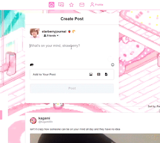
peachy keen ao3 site skin
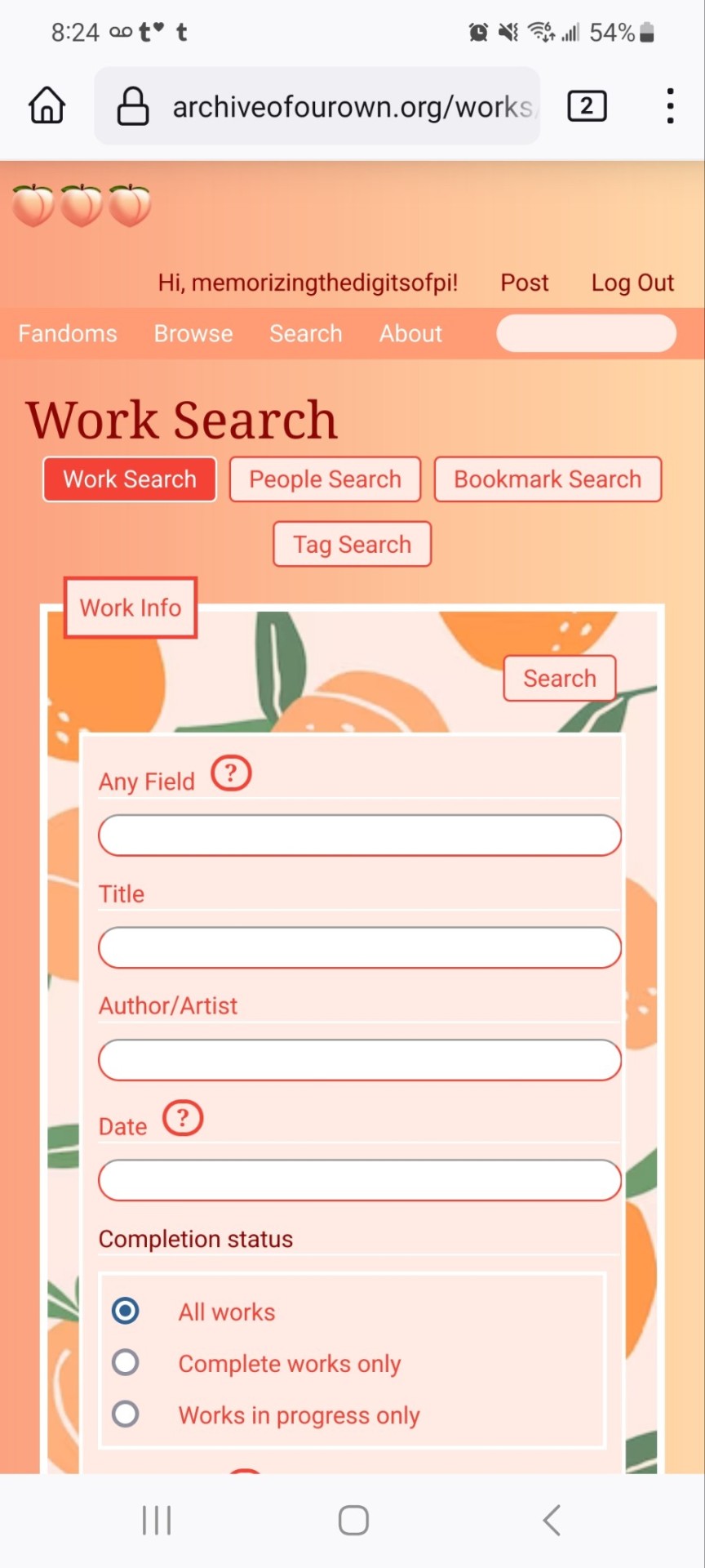
If you'd like to add this site skin to your AO3 account, the code is under the cut.
Colours Used: pale peach: #ffeae4 darker peach: #f3c6ba yellow: #ffd7a8 orange: #ff9b75 reddish orange: #f44336 darkest orange: #8E0505
CSS:
#outer { background: linear-gradient(90deg, rgba(255,155,117,.9) 0%, rgba(255,215,168,1) 100%); }
#header .primary { background: #ff9b75; background-repeat: repeat; box-shadow: none; }
#search .button, #header .logo { display: none; }
#header .heading a, #greeting img.icon { visibility: hidden; }
#header #search .text { background: #ffeae4; border: none; box-shadow: none; width: 7em; }
#header h1.heading a::before { content: " 🍑🍑🍑"; visibility: visible; }
.splash .module h3 { border-bottom: none; color: #f44336; }
#header .menu, #small_login { background: #ffeae4; box-shadow: none; width: 20em; }
#greeting .user > li a { color: #8E0505; }
#header .menu li, .splash .news li { border-bottom: none; }
#header .actions a:hover, #header .dropdown:hover a.dropdown-toggle, #header .menu li a { background: none; color: #f44336 !important; }
#footer { background: #ff9b75; }
#main { color: #8E0505; }
#main a { color: #f44336; }
.splash .favorite li:nth-of-type(2n+1) a { background: #ffeae4; border: 1px solid #ffeae4; border-radius: 5px; }
.splash .favorite li:nth-of-type(2n+1) a:hover, .splash .favorite li:nth-of-type(2n+2) a:hover { background: #f44336; border: 1px solid #f44336; border-radius: 5px; color: #fff !important; }
.resp-sharing-button--twitter, a.resp-sharing-button__link { color: #fff !important; }
.listbox, fieldset, fieldset dl dl, fieldset fieldset fieldset, fieldset fieldset dl dl, dd.hideme, form blockquote.userstuff, .dynamic form { background: url("https://image.freepik.com/free-vector/vector-seamless-pattern-with-peaches_1015-1760.jpg"); background-repeat: repeat; border: 4px solid #fff; box-shadow: none; }
form dl { background: #ffeae4; border: 2px solid #fff; box-shadow: none; }
input, textarea { border: 1px solid #f44336; box-shadow: none; }
input:focus, select:focus, textarea:focus { background: #ffeae4; }
form dt { border-bottom: 1px solid #fff; }
form dd.required { color: #8E0505; }
.LV_invalid { background: #ffd7a8; border: 1px solid #fff; color: #f44336; box-shadow: none; }
.LV_invalid_field, input.LV_invalid_field:hover, input.LV_invalid_field:active, textarea.LV_invalid_field:hover, textarea.LV_invalid_field:active { border: 1px solid #8E0505; }
.autocomplete div.dropdown ul { background: #fff; border: 1px solid #f44336; color: #f44336; box-shadow: none; }
.autocomplete .dropdown ul li:hover, .autocomplete .dropdown li.selected { background: #f44336; color: #fff; }
.required .autocomplete, .autocomplete .notice { color: #f44336; }
.ui-sortable li { background: #ffd7a8; border: 2px solid #fff; box-shadow: none; }
.ui-sortable li:hover { background: #ff9b75; border: 2px solid #fff; box-shadow: none; }
.ui-draggable form { box-shadow: none; }
.notice, .comment_notice, .kudos_notice, ul.notes, .caution, .error, .comment_error, .kudos_error, .alert.flash, muted.notice, form.verbose legend, .verbose form legend, span.question, span.symbol, select { background: #ffeae4; color: #f44336; border: 2px solid #f44336; box-shadow: none !important; }
#modal { background: #ffeae4; border: 4px solid #ff9b75; box-shadow: none; }
#modal .content { border-bottom: none; }
.actions a:visited, .action:visited, .action a:link, .action a:visited { color: #f3c6ba; }
.actions a:hover, .actions input:hover, .actions a:focus, .actions input:focus, label.action:hover, .action:hover, .action:focus { color: #f44336; border-top: none; border-left: none; box-shadow: none; background: #f3c6ba; }
.actions a:active, .current, a.current, a:link.current, .current a:visited { color: #fff; background: #ff9b75; border-color: #fff; box-shadow: none; }
.actions label.disabled { background: #ff9b75; }
.actions .disabled select { color: #fff; border-color: #fff; }
.delete a, span.delete { color: #f44336; box-shadow: none; }
.secondary { background: #fff; border: 2px solid #f44336; box-shadow: none; }
.own, .draft, .draft .wrapper, .unread, .child, .unwrangled, .unreviewed { background: #ffeae4 !important; }
.draft { border: 2px dashed #ff9b75; }
span.unread, .replied, span.claimed, .actions span.defaulted { background: #f3c6ba; color: #f44336; border: 1px solid #fff; border-bottom: none; }
.actions span.defaulted { color: #8E0505; }
.draggable, .droppable, span.requested, .nominations .rejected { color: #8E0505; }
.nominations .approved { background: #ffeae4; }
.nominations .rejected { background: #f3c6ba; }
span.offered.requested { color: #ffeae4; }
.wrapper { box-shadow: none; }
dl.index dd { background: #f3c6ba; }
p.kudos { background: url("https://64.media.tumblr.com/14dd2ee05dbcc111dab41d6206985fe8/b1eb33fb168e0088-4b/s1280x1920/8fabca965895c42bae4d746506ffc96324eb2fd5.png"); background-repeat: no-repeat; }
.statistics .index li:nth-of-type(even) { background: #f3c6ba; }
fieldset fieldset.listbox { background: #ffeae4; border: 2px solid #ff9b75; box-shadow: none; }
.listbox>.heading, .listbox .heading a:visited { color: #f44336; }
.listbox .index { background: #ffeae4; box-shadow: none; }
dl.meta { border: 2px solid #f44336; background: #ffeae4; }
.actions a, .actions a, .action, input[type="submit"], button, .actions label, .actions a, .actions a:link, .action, .action:link, .actions input, input[type=submit], button, .actions label { background: #ffeae4; border: 1px solid #f44336; text-shadow: none; color: #f44336; }
.current, #dashboard .current { background: #f44336; border: 1px solid #fff; text-shadow: none; color: #fff; }
#dashboard.own { border-top: none; border-bottom: none; }
#dashboard a { color: #f44336 !important; }
#dashboard a:hover { background: #ff9b75; }
label { color: #f44336; }
li.blurb, fieldset ul { background: #ffeae4 !important; border: 2px solid #fff; }
#header h2.collections, .reading h4.viewed, dl.index { background: #ffeae4; color: #f44336; }
.comment h4.byline { background: #f3c6ba; border-bottom: 2px solid #fff; }
.comment div.icon { border-bottom: 5px solid #ff9b75; }
li.comment { border: 2px solid #fff; background: #f3c6ba; }
li.comment ul.actions { background: transparent !important; border: none !important; }
#stat_chart g[clip-path^=url] > g:nth-of-type(2) rect, #stat_chart svg g:nth-of-type(2) > g rect:last-of-type, #stat_chart g[clip-path^=url] > g:nth-of-type(2) rect:first-of-type { opacity: 50% !important; }
h5.fandoms.heading a, .fandom .tag, .work .fandom a.tag { font-variant: small-caps; }
.warnings .tag, .work .warning a.tag { background: #8E0505; border: 1px solid #8E0505; border-radius: 5px; color: #fff !important; padding-left: .5em; padding-right: .5em; }
.relationships .tag, .work .relationships a.tag { background: #f44336; border: 1px solid #f44336; border-radius: 5px; color: #fff !important; font-weight: bold; padding-left: .5em; padding-right: .5em; }
.characters .tag, .work .characters a.tag { background: #ff9b75; border: 1px solid #ff9b75; border-radius: 5px; color: #fff !important; font-weight: bold; padding-left: .5em; padding-right: .5em; }
.freeforms .tag, .work .freeforms a.tag { color: #f44336 !important; }
.commas li:after { content: none; }
ul.tags { line-height: 190%; }
1K notes
·
View notes
Text
dark flat ao3 skin v2.0


1. log in and go HERE
2. click button "Create Site Skin"
3. name it whatever
4. copy/paste code from below in "CSS" field
5. "Submit"
6. make sure you clicked button "Use" HERE in the list of skins
7. change it as you like
CSS:
outer .region,
footer .group,
.post fieldset fieldset, fieldset fieldset { background: none; }
body, .group, .group .group, .region, .flash, fieldset, fieldset fieldset ul, form dl, textarea,
main .verbose legend,
.verbose fieldset, .notice, ul.notes, input, textarea, table, th, td:hover, tr:hover, .symbol .question:hover,
modal,
.ui-sortable li, .required .autocomplete, .autocomplete .notice, .system .intro, .comment_error, .kudos_error, div.dynamic, .dynamic form,
ui-datepicker-div,
.ui-datepicker table { color: #eee; border-color: #151619; outline: #111; box-shadow: none; }
form .notice, form ul.notes { box-shadow: none; }
workskin {
font-size: 1.2em; margin: auto; padding: 0 0.25em; max-width: 60em; overflow-x: auto; overflow-y: hidden; position: relative; }
.actions a, .actions a:link, .action, .action:link, .actions input, input[type="submit"], button, .current, .actions label { border-radius: 0; }
header ul.primary,
outer #footer,
.toggled form { background: #1a1b1f; }
header .primary {
background: none; padding: 10px 0; width: 100%; box-shadow: none; }
fieldset, form dl, fieldset dl dl, fieldset fieldset fieldset, fieldset fieldset dl dl, dd.hideme, form blockquote.userstuff { background: #1a1b1f !important; }
.user.navigation.actions>li { margin-top: 0.3em !important; }
header .menu,
small_login {
border: 1px solid #1f2126; box-shadow: none; padding: 0; }
.tags.group, .more.group { margin-top: 0.6em; }
header .actions a:hover,
header .actions a:focus,
header .dropdown:hover a,
header .open a,
header .menu,
small_login,
.group.listbox, fieldset fieldset.listbox, form blockquote.userstuff, input:focus, textarea:focus, li.relationships a, .group.listbox .index, .dashboard fieldset fieldset.listbox .index,
dashboard a:hover,
th,
dashboard .secondary,
.secondary, .thread .even, .system .tweet_list li, .ui-datepicker tr:hover { background: #151619; }
.userstuff p { text-align: justify; margin: 1.286em auto; padding: 0; line-height: 1.5; }
.tags.commas { margin: 1.5em auto; }
header .dropdown .menu a:hover,
header .dropdown .menu a:focus,
.splash .favorite li:nth-of-type(odd) a, .ui-datepicker td:hover,
tos_prompt .heading,
tos_prompt [disabled] {
background: #22262a; }
outer,
.javascript, .statistics .index li:nth-of-type(even),
tos_prompt,
.announcement input[type="submit"] { background: #151619; }
.filters .submit input { border: 1px solid #202227; background-color: #202227; height: 110%; margin: 1em 0; min-height: 2.286em; padding-left: 0; padding-right: 0; text-align: center; white-space: normal; }
header ul.primary,
footer,
dashboard ul,
dl.meta, .group.listbox, fieldset fieldset.listbox,
main li.blurb,
form blockquote.userstuff, div.comment, li.comment, .toggled form, form dl dt, form.single fieldset,
inner .module .heading,
.bookmark .status span, .splash .news li, .filters .group dt.bookmarker { border-color: #1a1b1f; }
.work.navigation.actions { width: 100%; }
dl.meta { border: none; }
.splash .news li { padding: 1em; }
fieldset, form dl, fieldset dl dl, fieldset fieldset fieldset, fieldset fieldset dl dl, dd.hideme, form blockquote.userstuff { padding: 1em; }
.logged-in .splash>.module { width: 100% !important; }
dl.meta { max-width: 75em; margin: auto; clear: right; padding: 2em 1.75em; position: relative; overflow: hidden; }
.group.listbox, fieldset fieldset.listbox,
main li.blurb,
.wrapper,
dashboard .secondary,
.secondary, form blockquote.userstuff, .thread .comment, .toggled form { box-shadow: none; }
dashboard .current,
.actions a:active,
outer .current,
a.current, .current a:visited, span.unread, .replied, span.claimed, dl.index dd, .own, .draft, .draft .unread, .child, .unwrangled, .unreviewed, .ui-sortable li:hover { background: #1a1b1f; border-color: #1f2126; }
greeting .menu {
right: 0; border: 1px solid #1f2126; box-shadow: none; }
select { background-color: #202227; color: #fff; border: 1px solid #202227; min-height: 3em; border-radius: 0; padding: 0 0.6em; }
input:focus, select:focus, textarea:focus { background: #202227; }
body, .toggled form, .dynamic form, .secondary, .dropdown { background: #202227; color: #fff; margin: 0; padding: 0; }
footer a:hover,
footer a:focus,
.autocomplete .dropdown ul li:hover, .autocomplete .dropdown li.selected, a.tag:hover, .listbox .heading a.tag:visited:hover, .symbol .question, .qtip-content { background: #a7a7a7; color: #111; }
.splash .favorite li:nth-of-type(odd) a:hover, .splash .favorite li:nth-of-type(odd) a:focus { background: #a7a7a7; color: #111; }
header #greeting img,
header .heading a,
header .heading a:visited,
header .user a:hover,
header .user a:focus,
header fieldset,
header form,
header p,
dashboard a:hover,
.actions a:hover, .actions input:hover, .delete a, span.delete, span.unread, .replied, span.claimed, .draggable, .droppable, span.requested, a.work, .blurb h4 a:link, .blurb h4 img, .splash .module h3, .splash .browse li a:before, .required, .error, .comment_error, .kudos_error, a.cloud7, a.cloud8,
tos_prompt .heading {
color: #a7a7a7; }
header .menu li {
border-bottom: 1px solid #2c2c2c; margin: 0; text-align: left; }
greeting .icon,
dashboard,
dashboard.own,
.error, .comment_error, .kudos_error, .LV_invalid, .LV_invalid_field, input.LV_invalid_field:hover, input.LV_invalid_field:active, textarea.LV_invalid_field:hover, textarea.LV_invalid_field:active, .qtip-content { border-color: #151619; }
dashboard.own {
border: none; }
form.filters dl { margin-left: 0; margin-right: 0; }
.filters .expander:focus { outline: none; }
.filters .expander { padding: 0.45em 0 0.45em 14px; }
.filters .group dt.search, .filters .range dt { padding: 1.25em 0 0.4em 0; }
a.tag { border-bottom: 1px dotted !important; }
a, a:link, a.tag,
header a,
header a:visited,
header .primary .open a,
header .primary .dropdown:hover a,
header .primary .dropdown a:focus,
header #search input:focus,
header #search input:hover,
dashboard a,
dashboard span,
dashboard .current,
.heading, .group .heading, .filters dt a:hover { color: #fff; }
header .dropdown .menu a {
padding: .75em .5em .75em; }
header #search .text {
background: #151619 !important; border-radius: 0; margin: 0.2857em 0.429em; }
a:visited, .actions a:visited, .action a:link, .action a:visited, .listbox .heading a:visited, span.series .divider { color: #999; }
a:active, a:focus, button:focus { outline: none; }
.actions a, .actions a:link, .action, .action:link, .actions input, input[type="submit"], button, .current, .actions label,
header .actions a {
background: #23252a; border-color: #23252a; color: #eee; box-shadow: none; text-shadow: none; }
.actions a:hover, .actions input:hover,
dashboard a:hover,
.actions a:focus, .actions input:focus,
dashboard a:focus {
color: #fff; border-color: #101214; box-shadow: none; background-color: #101214; }
.actions a:active, .current, a.current, .current a:visited { color: #fff; background: #101214; border-color: #101214; box-shadow: none; }
.delete a, span.delete { box-shadow: none; }
ul.required-tags, .bookmark .status span, .blurb .icon { opacity: 0.9; border: 0; }
outer .group .heading,
header .actions a,
fieldset.listbox .heading, .userstuff .heading, .heading, .userstuff h2 { text-shadow: none; color: #fff; background: none; }
header .actions a,
fieldset fieldset, .mce-container button, .filters .expander { box-shadow: none; }
fieldset fieldset.listbox { outline: none; }
form dd.required { color: #eee; }
.mce-container input:focus { background: #F3EFEC; }
.announcement .userstuff a, .announcement .userstuff a:link, .announcement .userstuff a:visited:hover { color: #fff; }
a, a:link, a:visited:hover { color: #fff; text-decoration: none; }
.announcement .userstuff a:visited { color: #666; }
.announcement .userstuff a:hover, .announcement .userstuff a:focus { color: #999; }
.event.announcement .userstuff a, .filters .expander { color: #eee; }
form.verbose legend, .verbose form legend { background: #151619; }
.listbox li.blurb { box-shadow: none; background: #1a1b1f; }
li.blurb, fieldset, form dl { border: none; }
li.blurb, .blurb .blurb { display: block; position: relative; clear: left; padding: 1em 1.4em; overflow: visible; background: #1a1b1f; }
dashboard ul {
float: none; display: block; padding: 0.26em 0; text-align: right; position: relative; background: none; }
user-fandoms {
padding: 1.4em 0; background: #1a1b1f; }
.listbox .index { padding: 0.6em 0; }
.bookmark div.user { background-color: #151619; }
.bookmark dl.stats { margin-bottom: 1.5em; margin-top: 1.5em; }
.dashboard .own, .comment span.unreviewed { background: #1a1b1f; opacity: 1.0; }
.own, .draft, .draft .wrapper, .unread, .child, .unwrangled, .unreviewed { background: #1a1b1f; opacity: 0.95; }
.actions a, .actions a:link, .action, .action:link, .actions input, input[type="submit"], button, .current, .actions label { padding: 0.5em 1em; border-radius: 0; }
header {
margin: 0 0 3em; }
.tags.group, .more.group { padding: 0.6em; }
dashboard a,
dashboard span {
line-height: 2.2; padding: 0 0.5em; }
.listbox>.heading, .listbox .heading a:visited { margin-left: .6em; }
.listbox, fieldset fieldset.listbox { border: 1px solid #1a1b1f; margin: 0.5em auto; box-shadow: none; }
.reading .user { margin-top: 1.5em; padding-top: 0.5em; border-top: 1px solid #23252a !important; }
.comment .userstuff { background-color: #1a1b1f !important; }
input, textarea { box-shadow: none; background: #151619; padding: 0.4em; }
.filters .indicator:before { background: #404248; color: #aaa; display: inline-block; border: 1px solid #404248; margin-right: 0.25em; background-image: none; }
.filters [type="checkbox"]+.indicator:before { padding: 0 0.25em; border-radius: 2px; }
.filters [type="checkbox"]:checked+.indicator:before { background: #970000; color: #ffffff; background-image: none; }
.filters input:checked+.indicator:before { border-color: #1a1b1f; }
.filters input:checked+.indicator+span { font-weight: 500; }
.filters .exclude [type="checkbox"]:checked+.indicator:before { background: #970000; color: #ffffff; background-image: none; }
.filters [type="radio"]:checked+.indicator:before { background: #970000; background-image: none; }
ui-datepicker-div,
.ui-datepicker table { background: #1a1b1f; }
.ui-datepicker td { border: 1px solid #23252a; }
.notice, .comment_notice, .kudos_notice, ul.notes, .caution, .error, .comment_error, .kudos_error, .alert.flash { background: #2e3138; border: 1px solid #2e3138; margin: 0.6em auto; padding: 1em; box-shadow: none; border-radius: 0; }
.listbox .index { padding: 0.6em; box-shadow: none; }
dl.meta { max-width: 75em; background: #1a1b1f; margin-top: 1em; }
dl.index dd { background: #151619 !important; }
form.search input[type="text"] { border-top-color: #151619; background-color: #202227; padding: 0.45em 0.45em; border-radius: 0; }
modal {
background: #1a1b1f; border: 10px solid #1a1b1f; margin: 3% 0; max-width: 800px; min-width: 200px; padding-bottom: 44px; position: relative; text-align: left; width: 80%; z-index: 501; }
.post .meta dd ul li { display: block; padding-bottom: 0.6em; }
workskin {
font-size: 1.2em; max-width: 52em; }
div.comment, li.comment { padding: 0.6em; background: #1a1b1f !important; }
192 notes
·
View notes
Text
So I created an ao3 skin and I would like to share it for anyone who wants to use it 💞
Here’s the code >>>
•Wizard Settings
Can be overridden by custom CSS :
Background color:
#FCEBFC
Text color:
#AF7E98
Header color:
#B34A81
Accent color:
#EABEE4
•CSS:
:root {
--background-color: #f9e3f2;
--text-color: #4d494a;
--form-background: #fdeff5;
}
body {
font-family: sans-serif;
}
.wrapper {
background-color: white;
border: 2px solid #f3c2e3;
}
#header {
padding: 10px;
margin-bottom: 15px;
}
#header a {
text-decoration: none;
}
#header a:hover {
text-decoration: underline;
}
#header ul.navigation.actions.user.signed-in {
display: flex;
justify-content: flex-end;
padding: 10px;
}
#main {
padding: 20px;
}
.heading {
padding: 8px;
margin-bottom: 10px;
font-weight: bold;
}
input[type="text"],
input[type="date"],
textarea,
select {
border: 1px solid #f3c2e3;
padding: 8px;
margin: 5px 0;
}
input[type="radio"],
input[type="checkbox"] {
margin-right: 5px;
}
.button,
input[type="submit"],
button {
border: none;
padding: 10px 20px;
cursor: pointer;
border-radius: 4px;
margin-bottom: 5px;
}
.button:hover,
input[type="submit"]:hover,
button:hover {
background-color: #e687b0;
}
#new_work_form .actions .button {
border: none;
padding: 10px 20px;
margin: 5px 5px 5px 0;
cursor: pointer;
border-radius: 4px;
}
.actions .button.current {
border: none;
padding: 10px 20px;
margin: 5px 5px 5px 0;
cursor: pointer;
border-radius: 4px;
}
#work_search_form .submit .button {
border: none;
padding: 10px 20px;
margin: 5px 0;
cursor: pointer;
border-radius: 4px;
}
#work_search_form .submit .button:hover {
background-color: #e687b0;
}
I decided to write it down for easier access🌸
I’ll leave a Reddit link below ⬇️ that explains how to use the code if it’s your first time easily. Credit to @tired-library-ghost on Reddit for this amazing explanation ❤️

67 notes
·
View notes
Text
Here's a quick look at what I'm working on with the editor. The CSS and JS for the editor specifically the line numbers are pulled entirely from the SAP. I used a very small library for this: tln
Theres a lot going on here but in simple terms I've built a system to load all the requirements for a Python web app from one file and I'm building a website editor with it. Going forward there will be more to see visually but I wanted to show something.
12 notes
·
View notes
Note
pi!!! please reupload the full css for your dark and glowy ao3 site skin i beg! i saw it and immediately was like that's the prettiest thing ever :0
code under the cut
#header { background-image: url("https://cdn.pixabay.com/photo/2022/10/19/16/56/fireflies-7533056_1280.jpg"); background-repeat: no-repeat; background-size: cover; background-position: center center; background-color: #152623; }
#header .heading { height: 15em; }
#header .primary { background: #0d1d1f; box-shadow: 0px 0px 15px #f9f6ce; }
#header .logo, #header .heading sup { visibility: hidden; }
#header .heading a { color: #152623; text-shadow: 0px 0px 15px #f9f6ce; }
.event .userstuff { background: #425e50; border: 1px solid #f9f6ce; }
#outer.wrapper { background: #0d1d1f; color: #f9f6ce; }
#main a { color: #8c9b76; }
#greeting a.dropdown-toggle, #header .actions a { color: #f9f6ce !important; text-shadow: 0px 0px 3px #152623; }
#greeting .menu, #header .dropdown .menu, #header .dropdown:hover a { background: #0d1d1f; box-shadow: 0px 0px 15px #f9f6ce; }
span.submit.actions input.button { display: none; }
#greeting img.icon { display: none; }
#header #search .text, .search [role="tooltip"] { background: #0d1d1f; box-shadow: 0px 0px 15px #f9f6ce; color: #f9f6ce !important; border: 1px solid #0d1d1f; }
form.search input[type=text], form.search input[type=submit], .autocomplete div.dropdown ul { background: #0d1d1f !important; border: none; box-shadow: 0px 0px 15px #f9f6ce; color: #f9f6ce; display: block; }
#header #search .text { width: 7em; }
.notice, .comment_notice, .kudos_notice, ul.notes, .caution, .error, .comment_error, .kudos_error, .alert.flash { background: #f9f6ce; box-shadow: 0px 0px 15px #f9f6ce !important; color: #0d1d1f; border: none; }
.notice a, .comment_notice a, .kudos_notice a, ul.notes a, .caution a, .error a, .comment_error a, .kudos_error a, .alert.flash a { color: #506957; font-weight: bold; }
.splash .module h3 { color: #f9f6ce; border-bottom: 2px solid #f9f6ce; }
.splash .favorite li:nth-of-type(2n+1) a { background: #f9f6ce; box-shadow: 0px 0px 15px #f9f6ce; color: #0d1d1f; font-weight: bold; font-variant: small-caps; }
.splash .favorite li:nth-of-type(2n+2) a { color: #f9f6ce; font-weight: bold; font-variant: small-caps; font-size: 110%; }
.splash .favorite li:nth-of-type(2n+1) a:hover, .splash .favorite li:nth-of-type(2n+2) a:hover { color: #f9f6ce; font-weight: bold; font-variant: small-caps; background: #425e50; }
#footer { background: #425e50; color: #f9f6ce; border-top: 3px solid #f9f6ce; box-shadow: 0px 0px 15px #f9f6ce; }
#footer a, #footer .heading { color: #f9f6ce; }
.actions a, .actions a:focus, .actions input:focus, .action:focus, .actions li input, .actions li input[type="submit"], input[type="submit"], .actions li label, ul.navigation.actions li a, .action:link, .actions a:link { background: #425e50; border: 1px solid #f9f6ce; color: #f9f6ce; box-shadow: 0px 0px 15px #f9f6ce; border-radius: 5px; }
.current, #dashboard .current { background: #f9f6ce !important; color: #0d1d1f !important; box-shadow: 0px 0px 15px #f9f6ce !important; border-radius: 5px; }
#dashboard.own { border-top: 5px solid #f9f6ce; border-bottom: 5px solid #f9f6ce; box-shadow: 0px 0px 15px #f9f6ce; }
#dashboard a:hover { background: #0d1d1f; box-shadow: 0px 0px 15px #f9f6ce; }
#dashboard a { color: #f9f6ce; }
dl.meta { border: 1px solid #f9f6ce; box-shadow: 0px 0px 15px #f9f6ce; }
.listbox .index { background: #0d1d1f; }
.listbox, fieldset fieldset.listbox { background: #f9f6ce; box-shadow: 0px 0px 15px #f9f6ce; }
form dl, fieldset, fieldset fieldset, fieldset fieldset fieldset, fieldset fieldset dl dl, dd.hideme, form blockquote.userstuff, input, select, select:focus, textarea, span.symbol.question, .own { background: #0d1d1f !important; color: #f9f6ce !important; border: 1px solid #f9f6ce; box-shadow: 0px 0px 15px #f9f6ce; }
.autocomplete li.added, .post .meta dd ul li.added, label, label.required { color: #f9f6ce; }
span.delete { background: #f9f6ce; box-shadow: 0px 0px 15px #f9f6ce; }
span.delete a { color: #0d1d1f !important; font-weight: bold; }
.ui-sortable li, .dynamic form, div.dynamic { background: #0d1d1f; border: 1px solid #f9f6ce; }
.dropdown { background: #0d1d1f; }
form.verbose legend, .verbose form legend { background: #f9f6ce; color: #0d1d1f; box-shadow: 0px 0px 15px #f9f6ce; }
li.blurb { border: 1px solid #f9f6ce; box-shadow: 0px 0px 15px #f9f6ce; }
.draft { background: #0d1d1f; color: #f9f6ce; border: 2px dashed #f9f6ce; box-shadow: 0px 0px 15px #f9f6ce; }
.draft .wrapper { background: #0d1d1f; border: 1px solid #f9f6ce; }
#header h2 { background: #f9f6ce !important; color: #0d1d1f; box-shadow: 0px 0px 15px #f9f6ce; }
#stat_chart svg rect:first-of-type { opacity: 60%; }
#stat_chart g[clip-path^=url] > g:nth-of-type(2) rect, #stat_chart svg g:nth-of-type(2) > g rect:last-of-type, #stat_chart g[clip-path^=url] > g:nth-of-type(2) rect:first-of-type { filter: hue-rotate(140deg); opacity: 80% !important; }
.statistics .index li:nth-of-type(2n) { background: #0d1d1f; border: 1px solid #f9f6ce; }
.reading h4.viewed, dl.index dd, table, th, dt.child { background: #0d1d1f; }
#modal, span.replied { background: #0d1d1f; color: #f9f6ce; border: 2px solid #f9f6ce; box-shadow: 0px 0px 15px #f9f6ce; }
h4.heading.byline { background: #f9f6ce; color: #0d1d1f; }
li.comment { border: 1px solid #f9f6ce; }
.comment div.icon { border-bottom: 5px solid #f9f6ce; box-shadow: 0px 0px 15px #f9f6ce; }
.thread .even { background: #425e50; }
.unread { background: #0d1d1f; border: 5px dashed #f9f6ce !important; }
span.unread { background: #f9f6ce; color: #0d1d1f; }
span.indicator::before { box-shadow: 0px 0px 15px #f9f6ce; }
.warnings .tag, .work .warning a.tag, dd.warning.tags a { border: 1px solid #f9f6ce; border-radius: 5px; background: #f9f6ce; padding-left: 2px; padding-right: 2px; box-shadow: 0px 0px 10px #f9f6ce; }
.relationships .tag, .work .relationships a.tag, dd.relationship.tags a { background: none; color: #f9f6ce !important; font-weight: bold; text-shadow: 0px 0px 15px #f9f6ce; }
.filters .expander { background: url("https://64.media.tumblr.com/3c89981f933f9f57157d6dcec6fd85a7/94c6737c6db9ad60-e5/s1280x1920/f7557e617a5439c506721bd326580a0cb4c1f8d8.png") left center no-repeat; color: #f9f6ce !important; font-weight: bold; }
.filters .expanded .expander { background: url("https://64.media.tumblr.com/dab095a2fd9387bc1e0c57747ba6b13f/94c6737c6db9ad60-ad/s1280x1920/c1a4e14e0565cdcac5d3e20bebac3ab440f2d607.png") left center no-repeat; }
8 notes
·
View notes
Note
Hola necro! vengo por tu sabiduría con una duda/idea que podría facilitar los registros para cualquier foro (si es que ya no esta implementado y no me entero xD). Veras, vi el super formulario de foroactivo y se me ocurrió que seria genial tener un formulario en el tema de registro, donde la persona solo pone los datos, envía y listo! el mensaje queda con el formato, en lugar del clásico copiar y pegar al final. Lo intente colocando el código en un tema y no funciono u.u ayuda por favor
¡Hola anon! Los formularios tal cual los entrega FA sólo se pueden poner en páginas HTML, no en temas de registro. Pero se puede adaptar para ser parte de una tablilla perfectamente.
Para facilitarnos el trabajo de la generación del formulario, vamos a usar el generador de nuestros compas brasileños de Forumeiros, que es super sencillo de usar y aplicar. Tu código terminará viéndose algo similar a esto:

Lo que pondremos en el post:
Cogerás el <form> entero y el <textarea> que se ve con los {{campos}}. Esto puedes reskinnearlo como quieras, mientras mantengas el form y los inputs y sus atributos con sus valores.
Lo que pondremos en el template viewtopic_body:
Al final del todo de nuestro template, pondremos los últimos dos <script>. No pongas el primero (el que termina con jquery.min.js).
Lo que pondremos en nuestro CSS:
Para evitar que el usuario pueda postear usando la quickreply o el botón de responder y sólo use el formulario, vamos a esconder un par de cosas. Puedes ponerlo en viewtopic_body si quieres ahorrarte un poquito de espacio en tu CSS.
body:has(#fa-generated-form) form#quick_reply, body:has(#fa-generated-form) .h3:has(+br+form#quick_reply), body:has(#fa-generated-form) a[href^="/post"][href*="&mode=reply"] { display: none; }
Espero que te sirva, ¡saludos! (Y gracias a los compas brasileños por el generador, ¡que es una maravilla!)
5 notes
·
View notes
Text
How to Create Multi-Step Forms With Vanilla JavaScript and CSS
New Post has been published on https://thedigitalinsider.com/how-to-create-multi-step-forms-with-vanilla-javascript-and-css/
How to Create Multi-Step Forms With Vanilla JavaScript and CSS
Multi-step forms are a good choice when your form is large and has many controls. No one wants to scroll through a super-long form on a mobile device. By grouping controls on a screen-by-screen basis, we can improve the experience of filling out long, complex forms.
But when was the last time you developed a multi-step form? Does that even sound fun to you? There’s so much to think about and so many moving pieces that need to be managed that I wouldn’t blame you for resorting to a form library or even some type of form widget that handles it all for you.
But doing it by hand can be a good exercise and a great way to polish the basics. I’ll show you how I built my first multi-step form, and I hope you’ll not only see how approachable it can be but maybe even spot areas to make my work even better.
We’ll walk through the structure together. We’ll build a job application, which I think many of us can relate to these recent days. I’ll scaffold the baseline HTML, CSS, and JavaScript first, and then we’ll look at considerations for accessibility and validation.
I’ve created a GitHub repo for the final code if you want to refer to it along the way.
The structure of a multi-step form
Our job application form has four sections, the last of which is a summary view, where we show the user all their answers before they submit them. To achieve this, we divide the HTML into four sections, each identified with an ID, and add navigation at the bottom of the page. I’ll give you that baseline HTML in the next section.
Navigating the user to move through sections means we’ll also include a visual indicator for what step they are at and how many steps are left. This indicator can be a simple dynamic text that updates according to the active step or a fancier progress bar type of indicator. We’ll do the former to keep things simple and focused on the multi-step nature of the form.,
The structure and basic styles
We’ll focus more on the logic, but I will provide the code snippets and a link to the complete code at the end.
Let’s start by creating a folder to hold our pages. Then, create an index.html file and paste the following into it:
Open HTML
<form id="myForm"> <section class="group-one" id="one"> <div class="form-group"> <div class="form-control"> <label for="name">Name <span style="color: red;">*</span></label> <input type="text" id="name" name="name" placeholder="Enter your name"> </div> <div class="form-control"> <label for="idNum">ID number <span style="color: red;">*</span></label> <input type="number" id="idNum" name="idNum" placeholder="Enter your ID number"> </div> </div> <div class="form-group"> <div class="form-control"> <label for="email">Email <span style="color: red;">*</span></label> <input type="email" id="email" name="email" placeholder="Enter your email"> </div> <div class="form-control"> <label for="birthdate">Date of Birth <span style="color: red;">*</span></label> <input type="date" id="birthdate" name="birthdate" max="2006-10-01" min="1924-01-01"> </div> </div> </section> <section class="group-two" id="two"> <div class="form-control"> <label for="document">Upload CV <span style="color: red;">*</span></label> <input type="file" name="document" id="document"> </div> <div class="form-control"> <label for="department">Department <span style="color: red;">*</span></label> <select id="department" name="department"> <option value="">Select a department</option> <option value="hr">Human Resources</option> <option value="it">Information Technology</option> <option value="finance">Finance</option> </select> </div> </section> <section class="group-three" id="three"> <div class="form-control"> <label for="skills">Skills (Optional)</label> <textarea id="skills" name="skills" rows="4" placeholder="Enter your skills"></textarea> </div> <div class="form-control"> <input type="checkbox" name="terms" id="terms"> <label for="terms">I agree to the terms and conditions <span style="color: red;">*</span></label> </div> <button id="btn" type="submit">Confirm and Submit</button> </section> <div class="arrows"> <button type="button" id="navLeft">Previous</button> <span id="stepInfo"></span> <button type="button" id="navRight">Next</button> </div> </form> <script src="script.js"></script>
Looking at the code, you can see three sections and the navigation group. The sections contain form inputs and no native form validation. This is to give us better control of displaying the error messages because native form validation is only triggered when you click the submit button.
Next, create a styles.css file and paste this into it:
Open base styles
:root --primary-color: #8c852a; --secondary-color: #858034; body font-family: sans-serif; line-height: 1.4; margin: 0 auto; padding: 20px; background-color: #f4f4f4; max-width: 600px; h1 text-align: center; form background: #fff; padding: 40px; border-radius: 5px; box-shadow: 0 0 10px rgba(0, 0, 0, 0.1); display: flex; flex-direction: column; .form-group display: flex; gap: 7%; .form-group > div width: 100%; input:not([type="checkbox"]), select, textarea width: 100%; padding: 8px; border: 1px solid #ddd; border-radius: 4px; .form-control margin-bottom: 15px; button display: block; width: 100%; padding: 10px; color: white; background-color: var(--primary-color); border: none; border-radius: 4px; cursor: pointer; font-size: 16px; button:hover background-color: var(--secondary-color); .group-two, .group-three display: none; .arrows display: flex; justify-content: space-between align-items: center; margin-top: 10px; #navLeft, #navRight width: fit-content; @media screen and (max-width: 600px) .form-group flex-direction: column;
Open up the HTML file in the browser, and you should get something like the two-column layout in the following screenshot, complete with the current page indicator and navigation.
Adding functionality with vanilla JavaScript
Now, create a script.js file in the same directory as the HTML and CSS files and paste the following JavaScript into it:
Open base scripts
const stepInfo = document.getElementById("stepInfo"); const navLeft = document.getElementById("navLeft"); const navRight = document.getElementById("navRight"); const form = document.getElementById("myForm"); const formSteps = ["one", "two", "three"]; let currentStep = 0; function updateStepVisibility() formSteps.forEach((step) => document.getElementById(step).style.display = "none"; ); document.getElementById(formSteps[currentStep]).style.display = "block"; stepInfo.textContent = `Step $currentStep + 1 of $formSteps.length`; navLeft.style.display = currentStep === 0 ? "none" : "block"; navRight.style.display = currentStep === formSteps.length - 1 ? "none" : "block"; document.addEventListener("DOMContentLoaded", () => navLeft.style.display = "none"; updateStepVisibility(); navRight.addEventListener("click", () => if (currentStep < formSteps.length - 1) currentStep++; updateStepVisibility(); ); navLeft.addEventListener("click", () => if (currentStep > 0) currentStep--; updateStepVisibility(); ); );
This script defines a method that shows and hides the section depending on the formStep values that correspond to the IDs of the form sections. It updates stepInfo with the current active section of the form. This dynamic text acts as a progress indicator to the user.
It then adds logic that waits for the page to load and click events to the navigation buttons to enable cycling through the different form sections. If you refresh your page, you will see that the multi-step form works as expected.
Multi-step form navigation
Let’s dive deeper into what the Javascript code above is doing. In the updateStepVisibility() function, we first hide all the sections to have a clean slate:
formSteps.forEach((step) => document.getElementById(step).style.display = "none"; );
Then, we show the currently active section:
document.getElementById(formSteps[currentStep]).style.display = "block";`
Next, we update the text that indicators progress through the form:
stepInfo.textContent = `Step $currentStep + 1 of $formSteps.length`;
Finally, we hide the Previous button if we are at the first step and hide the Next button if we are at the last section:
navLeft.style.display = currentStep === 0 ? "none" : "block"; navRight.style.display = currentStep === formSteps.length - 1 ? "none" : "block";
Let’s look at what happens when the page loads. We first hide the Previous button as the form loads on the first section:
document.addEventListener("DOMContentLoaded", () => navLeft.style.display = "none"; updateStepVisibility();
Then we grab the Next button and add a click event that conditionally increments the current step count and then calls the updateStepVisibility() function, which then updates the new section to be displayed:
navRight.addEventListener("click", () => if (currentStep < formSteps.length - 1) currentStep++; updateStepVisibility(); );
Finally, we grab the Previous button and do the same thing but in reverse. Here, we are conditionally decrementing the step count and calling the updateStepVisibility():
navLeft.addEventListener("click", () => if (currentStep > 0) currentStep--; updateStepVisibility(); );
Handling errors
Have you ever spent a good 10+ minutes filling out a form only to submit it and get vague errors telling you to correct this and that? I prefer it when a form tells me right away that something’s amiss so that I can correct it before I ever get to the Submit button. That’s what we’ll do in our form.
Our principle is to clearly indicate which controls have errors and give meaningful error messages. Clear errors as the user takes necessary actions. Let’s add some validation to our form. First, let’s grab the necessary input elements and add this to the existing ones:
const nameInput = document.getElementById("name"); const idNumInput = document.getElementById("idNum"); const emailInput = document.getElementById("email"); const birthdateInput = document.getElementById("birthdate") const documentInput = document.getElementById("document"); const departmentInput = document.getElementById("department"); const termsCheckbox = document.getElementById("terms"); const skillsInput = document.getElementById("skills");
Then, add a function to validate the steps:
Open validation script
function validateStep(step)
Here, we check if each required input has some value and if the email input has a valid input. Then, we set the isValid boolean accordingly. We also call a showError() function, which we haven’t defined yet.
Paste this code above the validateStep() function:
function showError(input, message) const formControl = input.parentElement; const errorSpan = formControl.querySelector(".error-message"); input.classList.add("error"); errorSpan.textContent = message;
Now, add the following styles to the stylesheet:
Open validation styles
input:focus, select:focus, textarea:focus outline: .5px solid var(--primary-color); input.error, select.error, textarea.error outline: .5px solid red; .error-message font-size: x-small; color: red; display: block; margin-top: 2px; .arrows color: var(--primary-color); font-size: 18px; font-weight: 900; #navLeft, #navRight display: flex; align-items: center; gap: 10px; #stepInfo color: var(--primary-color);
If you refresh the form, you will see that the buttons do not take you to the next section till the inputs are considered valid:
Finally, we want to add real-time error handling so that the errors go away when the user starts inputting the correct information. Add this function below the validateStep() function:
Open real-time validation script
function setupRealtimeValidation() nameInput.addEventListener("input", () => if (nameInput.value.trim() !== "") clearError(nameInput); ); idNumInput.addEventListener("input", () => if (idNumInput.value.trim() !== "") clearError(idNumInput); ); emailInput.addEventListener("input", () => if (emailInput.validity.valid) clearError(emailInput); ); birthdateInput.addEventListener("change", () => if (birthdateInput.value !== "") clearError(birthdateInput); ); documentInput.addEventListener("change", () => if (documentInput.files[0]) clearError(documentInput); ); departmentInput.addEventListener("change", () => if (departmentInput.value !== "") clearError(departmentInput); ); termsCheckbox.addEventListener("change", () => if (termsCheckbox.checked) clearError(termsCheckbox); );
This function clears the errors if the input is no longer invalid by listening to input and change events then calling a function to clear the errors. Paste the clearError() function below the showError() one:
function clearError(input) const formControl = input.parentElement; const errorSpan = formControl.querySelector(".error-message"); input.classList.remove("error"); errorSpan.textContent = "";
And now the errors clear when the user types in the correct value:
The multi-step form now handles errors gracefully. If you do decide to keep the errors till the end of the form, then at the very least, jump the user back to the erroring form control and show some indication of how many errors they need to fix.
Handling form submission
In a multi-step form, it is valuable to show the user a summary of all their answers at the end before they submit and to offer them an option to edit their answers if necessary. The person can’t see the previous steps without navigating backward, so showing a summary at the last step gives assurance and a chance to correct any mistakes.
Let’s add a fourth section to the markup to hold this summary view and move the submit button within it. Paste this just below the third section in index.html:
Open HTML
<section class="group-four" id="four"> <div class="summary-section"> <p>Name: </p> <p id="name-val"></p> <button type="button" class="edit-btn" id="name-edit"> <span>✎</span> <span>Edit</span> </button> </div> <div class="summary-section"> <p>ID Number: </p> <p id="id-val"></p> <button type="button" class="edit-btn" id="id-edit"> <span>✎</span> <span>Edit</span> </button> </div> <div class="summary-section"> <p>Email: </p> <p id="email-val"></p> <button type="button" class="edit-btn" id="email-edit"> <span>✎</span> <span>Edit</span> </button> </div> <div class="summary-section"> <p>Date of Birth: </p> <p id="bd-val"></p> <button type="button" class="edit-btn" id="bd-edit"> <span>✎</span> <span>Edit</span> </button> </div> <div class="summary-section"> <p>CV/Resume: </p> <p id="cv-val"></p> <button type="button" class="edit-btn" id="cv-edit"> <span>✎</span> <span>Edit</span> </button> </div> <div class="summary-section"> <p>Department: </p> <p id="dept-val"></p> <button type="button" class="edit-btn" id="dept-edit"> <span>✎</span> <span>Edit</span> </button> </div> <div class="summary-section"> <p>Skills: </p> <p id="skills-val"></p> <button type="button" class="edit-btn" id="skills-edit"> <span>✎</span> <span>Edit</span> </button> </div> <button id="btn" type="submit">Confirm and Submit</button> </section>
Then update the formStep in your Javascript to read:
const formSteps = ["one", "two", "three", "four"];
Finally, add the following classes to styles.css:
.summary-section display: flex; align-items: center; gap: 10px; .summary-section p:first-child width: 30%; flex-shrink: 0; border-right: 1px solid var(--secondary-color); .summary-section p:nth-child(2) width: 45%; flex-shrink: 0; padding-left: 10px; .edit-btn width: 25%; margin-left: auto; background-color: transparent; color: var(--primary-color); border: .7px solid var(--primary-color); border-radius: 5px; padding: 5px; .edit-btn:hover border: 2px solid var(--primary-color); font-weight: bolder; background-color: transparent;
Now, add the following to the top of the script.js file where the other consts are:
const nameVal = document.getElementById("name-val"); const idVal = document.getElementById("id-val"); const emailVal = document.getElementById("email-val"); const bdVal = document.getElementById("bd-val") const cvVal = document.getElementById("cv-val"); const deptVal = document.getElementById("dept-val"); const skillsVal = document.getElementById("skills-val"); const editButtons = "name-edit": 0, "id-edit": 0, "email-edit": 0, "bd-edit": 0, "cv-edit": 1, "dept-edit": 1, "skills-edit": 2 ;
Then add this function in scripts.js:
function updateSummaryValues() nameVal.textContent = nameInput.value; idVal.textContent = idNumInput.value; emailVal.textContent = emailInput.value; bdVal.textContent = birthdateInput.value; const fileName = documentInput.files[0]?.name; if (fileName) const extension = fileName.split(".").pop(); const baseName = fileName.split(".")[0]; const truncatedName = baseName.length > 10 ? baseName.substring(0, 10) + "..." : baseName; cvVal.textContent = `$truncatedName.$extension`; else cvVal.textContent = "No file selected"; deptVal.textContent = departmentInput.value; skillsVal.textContent = skillsInput.value || "No skills submitted"; }
This dynamically inserts the input values into the summary section of the form, truncates the file names, and offers a fallback text for the input that was not required.
Then update the updateStepVisibility() function to call the new function:
function updateStepVisibility() formSteps.forEach((step) => document.getElementById(step).style.display = "none"; ); document.getElementById(formSteps[currentStep]).style.display = "block"; stepInfo.textContent = `Step $currentStep + 1 of $formSteps.length`; if (currentStep === 3) updateSummaryValues(); navLeft.style.display = currentStep === 0 ? "none" : "block"; navRight.style.display = currentStep === formSteps.length - 1 ? "none" : "block";
Finally, add this to the DOMContentLoaded event listener:
Object.keys(editButtons).forEach((buttonId) => const button = document.getElementById(buttonId); button.addEventListener("click", (e) => currentStep = editButtons[buttonId]; updateStepVisibility(); ); );
Running the form, you should see that the summary section shows all the inputted values and allows the user to edit any before submitting the information:
And now, we can submit our form:
form.addEventListener("submit", (e) => e.preventDefault(); if (validateStep(2)) alert("Form submitted successfully!"); form.reset(); currentFormStep = 0; updateStepVisibility(); );
Our multi-step form now allows the user to edit and see all the information they provide before submitting it.
Accessibility tips
Making multi-step forms accessible starts with the basics: using semantic HTML. This is half the battle. It is closely followed by using appropriate form labels.
Other ways to make forms more accessible include giving enough room to elements that must be clicked on small screens and giving meaningful descriptions to the form navigation and progress indicators.
Offering feedback to the user is an important part of it; it’s not great to auto-dismiss user feedback after a certain amount of time but to allow the user to dismiss it themselves. Paying attention to contrast and font choice is important, too, as they both affect how readable your form is.
Let’s make the following adjustments to the markup for more technical accessibility:
Add aria-required="true" to all inputs except the skills one. This lets screen readers know the fields are required without relying on native validation.
Add role="alert" to the error spans. This helps screen readers know to give it importance when the input is in an error state.
Add role="status" aria-live="polite" to the .stepInfo. This will help screen readers understand that the step info keeps tabs on a state, and the aria-live being set to polite indicates that should the value change, it does not need to immediately announce it.
In the script file, replace the showError() and clearError() functions with the following:
function showError(input, message) const formControl = input.parentElement; const errorSpan = formControl.querySelector(".error-message"); input.classList.add("error"); input.setAttribute("aria-invalid", "true"); input.setAttribute("aria-describedby", errorSpan.id); errorSpan.textContent = message; function clearError(input) const formControl = input.parentElement; const errorSpan = formControl.querySelector(".error-message"); input.classList.remove("error"); input.removeAttribute("aria-invalid"); input.removeAttribute("aria-describedby"); errorSpan.textContent = "";
Here, we programmatically add and remove attributes that explicitly tie the input with its error span and show that it is in an invalid state.
Finally, let’s add focus on the first input of every section; add the following code to the end of the updateStepVisibility() function:
const currentStepElement = document.getElementById(formSteps[currentStep]); const firstInput = currentStepElement.querySelector( "input, select, textarea" ); if (firstInput) firstInput.focus();
And with that, the multi-step form is much more accessible.
Conclusion
There we go, a four-part multi-step form for a job application! As I said at the top of this article, there’s a lot to juggle — so much so that I wouldn’t fault you for looking for an out-of-the-box solution.
But if you have to hand-roll a multi-step form, hopefully now you see it’s not a death sentence. There’s a happy path that gets you there, complete with navigation and validation, without turning away from good, accessible practices.
And this is just how I approached it! Again, I took this on as a personal challenge to see how far I could get, and I’m pretty happy with it. But I’d love to know if you see additional opportunities to make this even more mindful of the user experience and considerate of accessibility.
References
Here are some relevant links I referred to when writing this article:
How to Structure a Web Form (MDN)
Multi-page Forms (W3C.org)
Create accessible forms (A11y Project)
#:not#Accessibility#ADD#aria#Article#Articles#attention#attributes#background#border-radius#box#box-shadow#browser#buttons#challenge#change#classes#code#Color#content#CSS#CV#dept#direction#display#email#error handling#event#Events#Exercise
3 notes
·
View notes
Text
ok here's the code for the dnf flag ao3 skin, to use it create a new skin and paste it into the css section, thats pretty much it.
(also - to change the font find where i've put 'source sans pro' and change that to whatever u want. and for dark mode u can set a dark mode skin as the parent skin, and if u dont have one create a new skin using the wizard and u can then set the background colour to black + text colour to white with that, and also change the font size.)
2 notes
·
View notes
Text
Let's understand HTML

Cover these topics to complete your HTML journey.
HTML (HyperText Markup Language) is the standard language used to create web pages. Here's a comprehensive list of key topics in HTML:
1. Basics of HTML
Introduction to HTML
HTML Document Structure
HTML Tags and Elements
HTML Attributes
HTML Comments
HTML Doctype
2. HTML Text Formatting
Headings (<h1> to <h6>)
Paragraphs (<p>)
Line Breaks (<br>)
Horizontal Lines (<hr>)
Bold Text (<b>, <strong>)
Italic Text (<i>, <em>)
Underlined Text (<u>)
Superscript (<sup>) and Subscript (<sub>)
3. HTML Links
Hyperlinks (<a>)
Target Attribute
Creating Email Links
4. HTML Lists
Ordered Lists (<ol>)
Unordered Lists (<ul>)
Description Lists (<dl>)
Nesting Lists
5. HTML Tables
Table (<table>)
Table Rows (<tr>)
Table Data (<td>)
Table Headings (<th>)
Table Caption (<caption>)
Merging Cells (rowspan, colspan)
Table Borders and Styling
6. HTML Forms
Form (<form>)
Input Types (<input>)
Text Fields (<input type="text">)
Password Fields (<input type="password">)
Radio Buttons (<input type="radio">)
Checkboxes (<input type="checkbox">)
Drop-down Lists (<select>)
Textarea (<textarea>)
Buttons (<button>, <input type="submit">)
Labels (<label>)
Form Action and Method Attributes
7. HTML Media
Images (<img>)
Image Maps
Audio (<audio>)
Video (<video>)
Embedding Media (<embed>)
Object Element (<object>)
Iframes (<iframe>)
8. HTML Semantic Elements
Header (<header>)
Footer (<footer>)
Article (<article>)
Section (<section>)
Aside (<aside>)
Nav (<nav>)
Main (<main>)
Figure (<figure>), Figcaption (<figcaption>)
9. HTML5 New Elements
Canvas (<canvas>)
SVG (<svg>)
Data Attributes
Output Element (<output>)
Progress (<progress>)
Meter (<meter>)
Details (<details>)
Summary (<summary>)
10. HTML Graphics
Scalable Vector Graphics (SVG)
Canvas
Inline SVG
Path Element
11. HTML APIs
Geolocation API
Drag and Drop API
Web Storage API (localStorage and sessionStorage)
Web Workers
History API
12. HTML Entities
Character Entities
Symbol Entities
13. HTML Meta Information
Meta Tags (<meta>)
Setting Character Set (<meta charset="UTF-8">)
Responsive Web Design Meta Tag
SEO-related Meta Tags
14. HTML Best Practices
Accessibility (ARIA roles and attributes)
Semantic HTML
SEO (Search Engine Optimization) Basics
Mobile-Friendly HTML
15. HTML Integration with CSS and JavaScript
Linking CSS (<link>, <style>)
Adding JavaScript (<script>)
Inline CSS and JavaScript
External CSS and JavaScript Files
16. Advanced HTML Concepts
HTML Templates (<template>)
Custom Data Attributes (data-*)
HTML Imports (Deprecated in favor of JavaScript modules)
Web Components
These topics cover the breadth of HTML and will give you a strong foundation for web development.
Full course link for free: https://shorturl.at/igVyr
2 notes
·
View notes
Note
How do I make a tag/title/author or any link I click on remain the same color as if I haven't clicked on it? My OCD is going crazy over this, thank you in advance :DD
Btw: I'm using this skin, love it so much as someone who is light sensitive :))
hello! I found that removing all instances of the :visited css selector in your skin to work for this! edited skin below
#outer .region, #footer .group, .post fieldset fieldset, fieldset fieldset { background: none; }
body, .group, .group .group, .region, .flash, fieldset, fieldset fieldset ul, form dl, textarea, #main .verbose legend, .verbose fieldset, .notice, ul.notes, input, textarea, table, th, td:hover, tr:hover, .symbol .question:hover, #modal, .ui-sortable li, .required .autocomplete, .autocomplete .notice, .system .intro, .comment_error, .kudos_error, div.dynamic, .dynamic form, #ui-datepicker-div, .ui-datepicker table { background: #131517; color: #eee; border-color: #131517; outline: #111; box-shadow: none; }
form .notice, form ul.notes { box-shadow: none; }
#workskin { font-size: 1.2em; margin: auto; padding: 0 0.25em; max-width: 60em; overflow-x: auto; overflow-y: hidden; position: relative; }
.actions a, .actions a:link, .action, .action:link, .actions input, input[type="submit"], button, .current, .actions label { border-radius: 0; }
#header ul.primary, #outer #footer, .toggled form { background: #131517; }
#header .primary { background: none; padding: 10px 0; width: 100%; box-shadow: none; }
fieldset, form dl, fieldset dl dl, fieldset fieldset fieldset, fieldset fieldset dl dl, dd.hideme, form blockquote.userstuff { background: #1a1c1e !important; }
.user.navigation.actions>li { margin-top: 0.3em!important; }
#header .menu, #small_login { border:1px solid #1f2126; box-shadow: none; padding: 0 }
.tags.group, .more.group { margin-top: 0.6em; }
#header .actions a:hover, #header .actions a:focus, #header .dropdown:hover a, #header .open a, #header .menu, #small_login, .group.listbox, fieldset fieldset.listbox, form blockquote.userstuff, input:focus, textarea:focus, li.relationships a, .group.listbox .index, .dashboard fieldset fieldset.listbox .index, #dashboard a:hover, th, #dashboard .secondary, .secondary, .thread .even, .system .tweet_list li, .ui-datepicker tr:hover { background: #131517; }
.userstuff p { text-align: justify; margin: 1.286em auto; padding: 0; line-height: 1.5; }
.tags.commas { margin: 1.5em auto; }
.tweets { display: none; }
#header .dropdown .menu a:hover, #header .dropdown .menu a:focus, .splash .favorite li:nth-of-type(odd) a, .ui-datepicker td:hover, #tos_prompt .heading, #tos_prompt [disabled] { background: #22262a; }
#outer, .javascript, .statistics .index li:nth-of-type(even), #tos_prompt, .announcement input[type="submit"] { background: #131517; }
.filters .submit input { border: 1px solid #131517; background-color: #131517; height: 110%; margin: 1em 0; min-height: 2.286em; padding-left: 0; padding-right: 0; text-align: center; white-space: normal; }
#header ul.primary, #footer, #dashboard ul, dl.meta, .group.listbox, fieldset fieldset.listbox, #main li.blurb, form blockquote.userstuff, div.comment, li.comment, .toggled form, form dl dt, form.single fieldset, #inner .module .heading, .bookmark .status span, .splash .news li, .filters .group dt.bookmarker { border-color: #1a1c1e; background: #1a1c1e; }
.news, .readings { display: none; }
.work.navigation.actions { width: 100%; }
dl.meta { border: none; }
.splash .news li { padding: 1em; }
fieldset, form dl, fieldset dl dl, fieldset fieldset fieldset, fieldset fieldset dl dl, dd.hideme, form blockquote.userstuff { padding: 1.643em; }
li.blurb, fieldset, form dl { border: none; }
li.blurb, .blurb .blurb { display: block; position: relative; clear: left; padding: 1em 1.4em; overflow: visible; }
.logged-in .splash>.module { width: 100% !important; }
dl.meta { max-width: 75em; margin: auto; clear: right; padding: 2em 1.75em; position: relative; overflow: hidden; }
.group.listbox, fieldset fieldset.listbox, #main li.blurb, .wrapper, #dashboard .secondary, .secondary, form blockquote.userstuff, .thread .comment, .toggled form { box-shadow: none; }
#dashboard .current, .actions a:active, span.unread, .replied, span.claimed, dl.index dd, .own, .draft, .draft .unread, .child, .unwrangled, .unreviewed, .ui-sortable li:hover { background: #131517; border-color: #1f2126; }
#greeting .menu { right: 0; border: 1px solid #1f2126; box-shadow: none; }
select { background-color: #131517; color: #fff; border: 1px solid #131517; min-height: 2.4em; border-radius: 0; }
input:focus, select:focus, textarea:focus { background: #131517; }
input, textarea { min-height: 1.8em; box-shadow: none; }
#footer a:hover, #footer a:focus, .autocomplete .dropdown ul li:hover, .autocomplete .dropdown li.selected, a.tag:hover, .symbol .question, .qtip-content { background: #a7a7a7; color: #111; }
.splash .favorite li:nth-of-type(odd) a:hover, .splash .favorite li:nth-of-type(odd) a:focus { background: #a7a7a7; color: #111; }
#header #greeting img, #header .heading a, #header .user a:hover, #header .user a:focus, #header fieldset, #header form, #header p, #dashboard a:hover, .actions a:hover, .actions input:hover, .delete a, span.delete, span.unread, .replied, span.claimed, .draggable, .droppable, span.requested, a.work, .blurb h4 a:link, .blurb h4 img, .splash .module h3, .splash .browse li a:before, .required, .error, .comment_error, .kudos_error, a.cloud7, a.cloud8, #tos_prompt .heading { color: #a7a7a7; }
#header .menu li { border-bottom: 1px solid #2c2c2c; margin: 0; text-align: left; }
#greeting .icon, #dashboard, #dashboard.own, .error, .comment_error, .kudos_error, .LV_invalid, .LV_invalid_field, input.LV_invalid_field:hover, input.LV_invalid_field:active, textarea.LV_invalid_field:hover, textarea.LV_invalid_field:active, .qtip-content { border-color: #131517; }
#dashboard.own { border: none; }
form.filters dl { margin-left: 0; margin-right: 0; }
.filters .expander:focus { outline: none; }
.filters .expander { padding: 0.45em 0 0.45em 14px; }
.filters .group dt.search, .filters .range dt { padding: 1.25em 0 0.4em 0; }
a.tag { border-bottom: 1px dotted !important; }
a, a:link, a.tag, #header a, #header .primary .open a, #header .primary .dropdown:hover a, #header .primary .dropdown a:focus, #header #search input:focus, #header #search input:hover, #dashboard a, #dashboard span, #dashboard .current, .heading, .group .heading, .filters dt a:hover { color: #fff; }
#header .dropdown .menu a { padding: .75em .5em .75em; }
#header #search .text { background: #131517 !important; border-radius: 0; margin: 0.2857em 0.429em; }
.action a:link, span.series .divider { color: #999; }
a:active, a:focus, button:focus { outline: none; }
.actions a, .actions a:link, .action, .action:link, .actions input, input[type="submit"], button, .current, .actions label, #header .actions a { background: #1a1c1e; border-color: #1a1c1e; color: #eee; box-shadow: none; text-shadow: none; }
.actions a:hover, .actions input:hover, #dashboard a:hover, .actions a:focus, .actions input:focus, #dashboard a:focus { color: #fff; border-color: #101214; box-shadow: none; background-color: #101214; }
.actions a:active, .current, a.current { color: #fff; background: #101214; border-color: #101214; box-shadow: none; }
.delete a, span.delete { box-shadow: -1px -1px 2px rgba(255,255,255.25); }
ul.required-tags, .bookmark .status span, .blurb .icon { opacity: 0.9; border: 0; }
#outer .group .heading, #header .actions a, fieldset.listbox .heading, .userstuff .heading, .heading, .userstuff h2 { text-shadow: none; color: #fff; background: none; }
#header .actions a, fieldset fieldset, .mce-container button, .filters .expander { box-shadow: none; }
fieldset fieldset.listbox { outline: none; }
form dd.required { color: #eee; }
.mce-container input:focus { background: #F3EFEC; }
.announcement .userstuff a, .announcement .userstuff a:link { color: #fff; }
a, a:link { color: #fff; text-decoration: none; }
.announcement .userstuff a:hover, .announcement .userstuff a:focus { color: #999; }
.event.announcement .userstuff a, .filters .expander { color: #eee; }
8 notes
·
View notes
Text
Textareas with auto-increasing height using CSS — Amit Merchant — A blog on PHP, JavaScript, and more
2 notes
·
View notes
Text
MENU DROP DOWN
Esse menu e bem compacto e pode ser usado para LINKS EXTRAS, PARCEIROS, e o que a sua imaginação inventar.
PREVIEW:
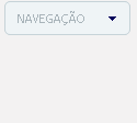
Bom ele e super simples de fazer então pra não deixar o nosso menu feinho e sem graça vou passar um código pra podermos personalizar ele, coloque o código a seguir no seu css :
/**** MENU DROP DOWN POR : IMPERIODOHTML *****/
input, textarea, option, select { background-color: #EFF4F6; border: 0 none; color: #a9b4ba; font: 11px/13px tahoma; letter-spacing: 0; padding: 7px; text-align: justify;border-radius:5px;border:1px #c6d3d8 solid;width:115px; } input:focus, textarea:focus { }
Note que esse código tem coisas como background, cor e etc isso tudo você pode mudar e deixar o seu menu do jeito que preferir. Agora você vai colar o código a seguir aonde quer que fique o menu :
<center><select class="select" name="Affiliates" onchange="window.open(this.options[this.selectedIndex].value)"> <option value=""><center>NAVEGAÇÃO</center> </option> <option value="">-----------------</option> <option value="LINK" target="blank">HOME</option> <option value="LINK" target="blank">ASK</option> <option value="LINK" target="blank">LINK</option> <option value="LINK" target="blank">LINK</option> </select></center>
Agora vamos entender o nosso código aonde está NAVEGAÇÃO e a palavra que vai aparecer no seu menu indicando o conteúdo, e Ali onde esta LINK e o o link que quando a pessoa clicar ira para o tal link, Mude HOME, ASK …. pelo nome do seu link e pronto.
0 notes
Text
Simple Markdown Editor with Real-Time Preview and Customizable Toolbar
MarkdownEditor is a lightweight JavaScript library that transforms standard textareas into full-featured Markdown editors. It is ideal for content management systems, blogs, and documentation platforms where users need to write or edit markdown syntax. Features: Real-time preview rendering of Markdown content Configurable toolbar with text formatting options Tailwind CSS integration for modern…
0 notes
Text

HTML
HTML Course Content
HTML, or *HyperText Markup Language*, is the standard language used for creating and structuring content on the web. It defines the structure of web pages through the use of elements and tags, which dictate how text, images, links, and other multimedia are displayed in a web browser. HTML provides the foundation for web documents, allowing developers to format content, organize sections, and create interactive features. It consists of a series of elements enclosed in angle brackets, such as <p> for paragraphs, <a> for links, and <img> for images, which together build the content and layout of a webpage.
HTML Contents
HTML (HyperText Markup Language) is the foundation of web pages and web applications. It structures content on the web, defining elements like headings, paragraphs, links, images, and other multimedia. Here’s a breakdown of key HTML contents:
1. *Basic Structure*:
*<!DOCTYPE html>*: Declares the document type and version of HTML.
*<html>*: The root element that encompasses the entire HTML document.
*<head>*: Contains meta-information about the document, such as title, character set, and links to CSS or JavaScript files.
*<body>*: Contains the content that is visible on the web page, including text, images, and interactive elements.
2. *Text Elements*:
*<h1> to <h6>*: Heading tags, with <h1> being the most important.
*<p>*: Paragraph tag for regular text.
*<a>*: Anchor tag for creating hyperlinks.
*<span>* and *<div>*: Generic containers for grouping inline and block content, respectively.
3. *Lists*:
*<ul>*: Unordered list.
*<ol>*: Ordered list.
*<li>*: List item, used within <ul> or <ol>.
4. *Images and Media*:
*<img>*: Embeds images.
*<video>* and *<audio>*: Embeds video and audio files.
*<figure>* and *<figcaption>*: For adding images or media with captions.
5. *Forms*:
*<form>*: Contains form elements for user input.
*<input>*: Various input fields (text, password, checkbox, radio, etc.).
*<textarea>*: For multi-line text input.
*<button>* and *<select>*: Buttons and dropdown menus.
6. *Tables*:
*<table>*: Defines a table.
*<tr>*: Table row.
*<th>*: Table header cell.
*<td>*: Table data cell.
7.*Semantic Elements*:
*<header>, *<footer>**: Defines the header and footer sections.
*<nav>*: Navigation section.
*<article>*: Independent content item.
*<section>*: Thematic grouping of content.
*<aside>*: Sidebar or additional content.
*<main>*: Main content of the document.
8. *Metadata and Links*:
*<meta>*: Provides metadata such as descriptions, keywords, and viewport settings.
*<link>*: Links external resources like CSS files.
*<script>*: Embeds or links JavaScript files.
Importance of HTML
HTML is critically important for several reasons:
1. *Foundation of Web Pages*:
HTML is the core language that structures content on the web. Without HTML, web pages wouldn’t exist as we know them. It organizes text, images, links, and other media into a cohesive and navigable format.
2. *Accessibility*:
Proper use of HTML ensures that web content is accessible to all users, including those with disabilities. Semantic HTML elements provide context to assistive technologies, making it easier for screen readers to interpret the content.
3. *SEO (Search Engine Optimization)*:
Search engines rely on HTML to understand the content of web pages. Properly structured HTML with relevant tags and attributes improves a website’s visibility in search engine results, driving more traffic to the site.
4. *Interoperability*:
HTML is universally supported by all web browsers, ensuring that content can be displayed consistently across different devices and platforms. This cross-compatibility makes HTML the most reliable way to share content on the web.
5. *Foundation for CSS and JavaScript*:
HTML is the backbone that supports styling and interactivity through CSS and JavaScript. It provides the structure that CSS styles and JavaScript enhances, creating dynamic, interactive, and visually appealing web experiences.
6. *Web Standards Compliance*:
HTML is maintained by the World Wide Web Consortium (W3C), which sets standards to ensure the web remains open, accessible, and usable. Following these standards helps developers create web content that is robust and future-proof.
7. *Ease of Learning and Use*:
HTML is relatively simple to learn, making it accessible to beginners and non-programmers. Its simplicity also allows for rapid development and prototyping of web pages.
In summary, HTML is essential because it structures and defines web content, ensuring it is accessible, searchable, and interoperable across various platforms. It is the foundation upon which modern web design and development are built.
1 note
·
View note